Automate Chart Prep: Build an AI Agent That Pulls Records Before Patient Visits
Automate Chart Prep: Build an AI Agent That Pulls Records Before Patient Visits
Every analyst I've ever met has the same dirty secret: they spend most of their week not analyzing anything, but prepping charts. Pulling data from three different systems, cleaning it, formatting it, dropping it into PowerPoint, then doing it all again when someone asks "can you add Q2?" It's grunt work. And it's eating your team alive.
Here's the reality. Data preparation consumes 60–80% of analyst time before a single chart gets made. A "quick chart" for a stakeholder meeting takes 45 minutes minimum, often closer to three hours once you factor in revisions. Finance and consulting teams burn 15–40 hours per month just updating charts for recurring reports. Not creating new insights. Updating existing ones.
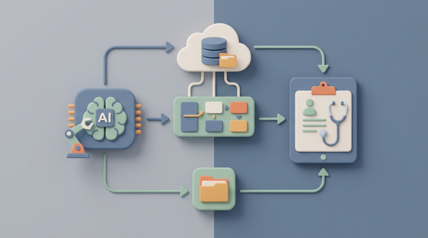
This is the kind of problem that's practically begging for an AI agent. Not a chatbot. Not a copilot that suggests chart colors. A proper autonomous agent that connects to your data sources, pulls the right records, preps the charts, and has everything ready before anyone walks into the room.
Let me show you how to build one with OpenClaw.
The Manual Workflow (And Why It's Broken)
Before we automate anything, let's be honest about what "chart prep" actually involves. It's not just making a chart. It's a nine-step pipeline that most teams execute manually, every single time:
Step 1: Data Extraction. Pull numbers from your ERP, CRM, database, spreadsheets, or SaaS tools. Often multiple sources for a single chart.
Step 2: Data Cleaning. Remove duplicates, fix formatting, handle missing values, standardize category names. The unglamorous stuff that takes forever.
Step 3: Transformation. Pivot tables, calculated fields, period-over-period comparisons. Turning raw data into something chartable.
Step 4: Analysis & Insight Selection. Deciding which metrics actually matter for this specific meeting, question, or audience.
Step 5: Chart Type Selection. Bar? Line? Heatmap? Waterfall? Most people default to whatever they used last time, which is usually wrong.
Step 6: Chart Creation & Customization. Building the thing. Labels, titles, annotations, trend lines.
Step 7: Branding & Formatting. Making it match the company style guide. Colors, fonts, logos, positioning.
Step 8: Review & Iteration. Stakeholder says "actually, can you break this out by region?" Back to step 1.
Step 9: Export & Distribution. Drop it into the deck, PDF, email, or dashboard. Pray nothing breaks.
And then next month, you do it all over again.
The tooling landscape hasn't fixed this. Excel and PowerPoint still account for an estimated 70–80% of business charts, even in companies that own Tableau and Power BI licenses. Teams use what I call the "Frankenstein stack"—Excel for analysis, PowerPoint for presentation, Slack for distribution, and prayer for version control.
The Real Cost of Manual Chart Prep
Let's put numbers on this.
A mid-sized SaaS company profiled in a 2023 Amplitude report had a single analyst spending 25 hours per month just updating executive dashboard charts. Not building new ones. Updating.
Marketing teams waste an average of 16 hours per month on manual chart creation, according to Venngage's 2023 State of Visual Content report.
A Fortune 500 consumer goods company found their monthly business review deck required roughly 120 person-hours across departments. Chart work was the largest component.
Investment banks assign junior analysts to "deck monkey" roles where chart formatting for client presentations consumes entire days. This is a real job function at firms paying these people six figures.
Beyond the raw time cost, there are compounding problems:
- Errors multiply. Manual copying between systems introduces mistakes. A misplaced decimal in a revenue chart that goes to the board is not a theoretical risk—it happens constantly.
- Inconsistency creates confusion. Different teams produce conflicting versions of the same metric because they pulled data at different times or applied different filters.
- Skill bottleneck. Good data visualization is a real skill. Most people don't have it. The result is pie charts with twelve slices, 3D bar graphs that distort comparisons, and dual-axis charts that mislead.
- Maintenance is a treadmill. Quarterly reports require near-complete recreation. The chart you spent three hours on in January needs to be rebuilt in April with fresh data.
This isn't a "nice to optimize" problem. It's a structural drag on every team that makes data-driven decisions.
What AI Can Actually Handle Right Now
I'm not going to oversell this. AI agents in 2026 are genuinely good at some parts of chart prep and genuinely bad at others. Here's the honest breakdown.
AI handles well:
- Connecting to data sources and extracting the right records
- Cleaning and transforming data (deduplication, formatting, pivoting)
- Recommending chart types based on data characteristics
- Generating charts from natural language instructions
- Applying consistent branding and formatting
- Auto-updating charts when source data changes
- Writing narrative summaries of what the chart shows
- Surfacing anomalies and interesting patterns you might miss
AI still struggles with:
- Deciding which story matters for this audience in this moment
- Strategic framing—what to emphasize or downplay
- Understanding the political context of a board meeting
- Ethical judgment about potentially misleading presentations
- Complex domain-specific knowledge (regulatory reporting, clinical data)
- Creative conceptual diagrams that aren't standard data charts
The sweet spot is clear: automate the mechanical 70%, apply human judgment to the critical 30%. That ratio alone represents a massive time savings.
Step-by-Step: Building a Chart Prep Agent on OpenClaw
Here's where it gets practical. OpenClaw gives you the infrastructure to build autonomous agents that handle multi-step workflows—exactly what chart prep requires. You're not stitching together five different APIs with duct tape. You're building a single agent that owns the pipeline.
Step 1: Define the Trigger
Your agent needs to know when to prep charts. The most common triggers:
- Calendar-based: Every Monday at 6 AM before the weekly leadership meeting.
- Event-based: A new dataset lands in your data warehouse.
- Request-based: Someone sends a Slack message or fills out a form.
In OpenClaw, you set this up as the agent's activation condition. For recurring reports, calendar triggers are the obvious choice. Here's how you'd configure it:
trigger:
  type: schedule
  cron: "0 6 * * 1"  # Every Monday at 6 AM
  timezone: "America/New_York"
context:
  meeting: "Weekly Leadership Review"
  audience: "C-suite"
  report_type: "performance_dashboard"
Step 2: Connect Your Data Sources
This is where most manual workflows die—the extraction phase. Your agent needs access to the systems where your data lives. OpenClaw supports direct connections to databases, APIs, and file storage.
data_sources:
  - name: "sales_db"
    type: postgres
    connection: ${SALES_DB_CONNECTION_STRING}
    queries:
      weekly_revenue: |
        SELECT date, product_line, region, revenue, units_sold
        FROM sales_summary
        WHERE date >= CURRENT_DATE - INTERVAL '7 days'

  - name: "marketing_metrics"
    type: api
    endpoint: "https://api.your-marketing-tool.com/v2/metrics"
    auth: ${MARKETING_API_KEY}
    params:
      date_range: "last_7_days"
      metrics: ["spend", "impressions", "conversions", "cpa"]

  - name: "finance_actuals"
    type: google_sheets
    sheet_id: ${FINANCE_SHEET_ID}
    range: "Monthly Actuals!A1:Z100"
One agent, multiple sources. No copying and pasting between tabs.
Step 3: Define the Cleaning and Transformation Rules
This is where you encode the tribal knowledge that currently lives in your analyst's head. What needs to be standardized? What gets filtered out? What calculated fields matter?
transformations:
  - source: sales_db.weekly_revenue
    steps:
      - deduplicate:
          key: ["date", "product_line", "region"]
      - standardize:
          column: "region"
          mapping:
            "NA": "North America"
            "EMEA": "Europe/Middle East"
            "APAC": "Asia Pacific"
      - calculate:
          name: "revenue_per_unit"
          formula: "revenue / units_sold"
      - aggregate:
          group_by: ["product_line"]
          metrics:
            total_revenue: "sum(revenue)"
            avg_deal_size: "mean(revenue_per_unit)"
            wow_change: "percent_change(revenue, period='week')"
This replaces the 45 minutes of Excel wrangling that happens every single week. Once you define these rules, they execute perfectly every time. No fat-finger errors. No forgotten filters.
Step 4: Specify the Charts
Now you tell the agent what to produce. You can be explicit about chart types or let the agent recommend based on data characteristics.
charts:
  - id: "revenue_by_product"
    title: "Weekly Revenue by Product Line"
    type: "bar"
    data: transformations.sales_db.weekly_revenue
    x_axis: "product_line"
    y_axis: "total_revenue"
    annotations:
      - type: "wow_change"
        position: "above_bar"
    style: "brand_default"

  - id: "marketing_efficiency"
    title: "Marketing Spend vs. Conversions (Last 7 Days)"
    type: "auto"  # Let the agent pick based on data shape
    data: transformations.marketing_metrics
    highlight: "anomalies"
    narrative: true  # Generate a text summary

  - id: "revenue_trend"
    title: "Revenue Trend — Last 12 Weeks"
    type: "line"
    data: transformations.sales_db.weekly_revenue
    x_axis: "date"
    y_axis: "total_revenue"
    group_by: "region"
    trendline: true
    forecast: 4  # Project 4 weeks forward
The style: "brand_default" line is doing real work here. You define your brand guidelines once—hex colors, fonts, logo placement—and every chart that comes out of this agent is automatically on-brand. No more "can you change that blue to our blue?"
Step 5: Set Up the Output and Distribution
Charts are useless if they don't get to the right people in the right format at the right time.
output:
  - format: "google_slides"
    template: ${WEEKLY_REVIEW_TEMPLATE_ID}
    slide_mapping:
      slide_3: "revenue_by_product"
      slide_4: "marketing_efficiency"
      slide_5: "revenue_trend"
    share_with: ["leadership-team@company.com"]

  - format: "slack"
    channel: "#exec-dashboard"
    message: |
      📊 Weekly charts are ready for Monday's leadership review.
      Key highlights:
      {{charts.revenue_by_product.narrative}}
      {{charts.marketing_efficiency.narrative}}
      Full deck: {{output.google_slides.url}}

  - format: "png"
    destination: "s3://company-charts/weekly/"
    naming: "{{chart.id}}_{{date}}.png"
Monday at 6 AM, the leadership team wakes up to a Slack message with the key highlights and a link to the fully formatted deck. No analyst had to touch it.
Step 6: Build in the Feedback Loop
This is what separates a useful agent from a brittle script. Your agent should handle ad-hoc requests and learn from corrections.
interaction:
  channel: "slack"
  commands:
    - trigger: "break out by region"
      action: "add_dimension"
      param: "region"
      regenerate: true

    - trigger: "add last quarter"
      action: "extend_date_range"
      param: "last_quarter"
      regenerate: true

    - trigger: "swap to waterfall"
      action: "change_chart_type"
      param: "waterfall"
      regenerate: true

  memory:
    store_preferences: true
    learn_from_corrections: true
When the CFO says "actually, can you break this out by region?"—instead of an analyst spending 30 minutes rebuilding the chart, someone types a command in Slack and the agent regenerates it in seconds.
What Still Needs a Human
I said I'd be honest, so here it is. Don't try to automate these parts:
Story selection. The agent can show you that revenue dipped 12% in APAC last week. It can't tell you whether to lead with that in the board meeting or bury it after the good news about North America. That's a judgment call that depends on organizational context, political dynamics, and strategic priorities.
Audience calibration. A chart for the CEO needs to be different from the same chart for the regional sales manager. Different level of detail, different framing, different emphasis. An agent can apply templates, but a human decides which template.
Ethical guardrails. Truncated y-axes, cherry-picked date ranges, misleading dual-axis scales—these are choices that an AI might make innocently but a human needs to catch.
Final sign-off. Executives still want a person to vouch for the numbers. "The AI made this" is not yet an acceptable answer when the board asks "are these numbers right?" Someone needs to review the output, especially for high-stakes presentations.
The best setup is clear: the agent does the heavy lifting, a human does the final 10-minute review instead of the 3-hour build.
Expected Time and Cost Savings
Let's be conservative about this. Based on the benchmarks cited earlier:
| Metric | Manual | With OpenClaw Agent | Savings |
|---|---|---|---|
| Weekly report prep | 4–6 hours | 30 min review | ~85% |
| Monthly business review | 15–40 hours | 3–5 hours (review + strategic framing) | ~80% |
| Ad-hoc chart request | 45–180 min | 2–5 min + review | ~90% |
| Data errors per quarter | 3–8 significant | Near zero (automated validation) | ~95% |
| Time to update when data changes | 1–3 hours | Automatic | ~100% |
For a team with two analysts spending 20 hours per month each on chart prep, you're reclaiming roughly 32 hours per month. That's an entire work week freed up for actual analysis—the thing you hired analysts to do.
The compounding effect matters too. Those 32 hours per month translate to almost 400 hours per year. At a blended analyst cost of $75/hour, that's $30,000 in recovered productivity from a single workflow. Scale that across finance, marketing, sales ops, and executive reporting, and you're looking at six figures easily.
Where to Start
Don't try to automate everything at once. Pick your most painful recurring report—the one that eats the most time, has the most manual steps, and runs on the most predictable schedule. Build your first OpenClaw agent for that single workflow. Get it working. Let the team trust it. Then expand.
The agents and templates you need to get started are available on Claw Mart, where you can find pre-built chart prep configurations, data source connectors, and output formatters that dramatically cut your setup time. Instead of building every component from scratch, you browse what's already been built, customize it for your stack, and deploy.
If building this yourself still feels like more than you want to take on, consider Clawsourcing the project. Post the job on Claw Mart, describe your data sources, report cadence, and output requirements, and let an experienced OpenClaw builder handle the implementation. You get a working agent without the learning curve, and you can focus on what you're actually good at—making decisions with the data, not formatting it.
The chart prep treadmill has been stealing your team's time for years. It's a solved problem now. Go solve it.